Web Display Mockup
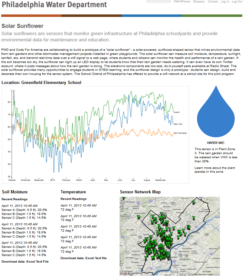
Here’s a quick mockup of a web page displaying data from the Solar Sunflower—none of this represents real data. It helps to visualize what the end product looks like, where the site lives (this presents it as a page on phillywatersheds.org, a Philadelphia Water Department website), and what features we want. Let’s break down what we’ve got so far:
- A multi-line graph that’s updated in real time with soil moisture sensor values. Three data series, three soil moisture sensors. This sample image was generated using Javascript D3, a really powerful graphing library.
- A “water me!” graphic. This could be something as simple as an image swap; when the soil sensors read below some threshold value for moisture, a raindrop appears. When the value is above the threshold, a green leaf is shown.
- A map of locations of all the sensors. Although we’re only dealing with two sites at the moment (Greenfield and Nebinger Elementary schools), hopefully there will be a growing network of schools involved. By encoding latitude and longitude of each school, we can click on a point on the map and call up that school’s current data.
- And finally, downloadable text or Excel files of the data. This doesn’t sound too exciting, but I think it’s where the in-depth educational value lies. Creating plots, correlating data, identifying trends, and analyzing statistics all rely on access to this raw data.